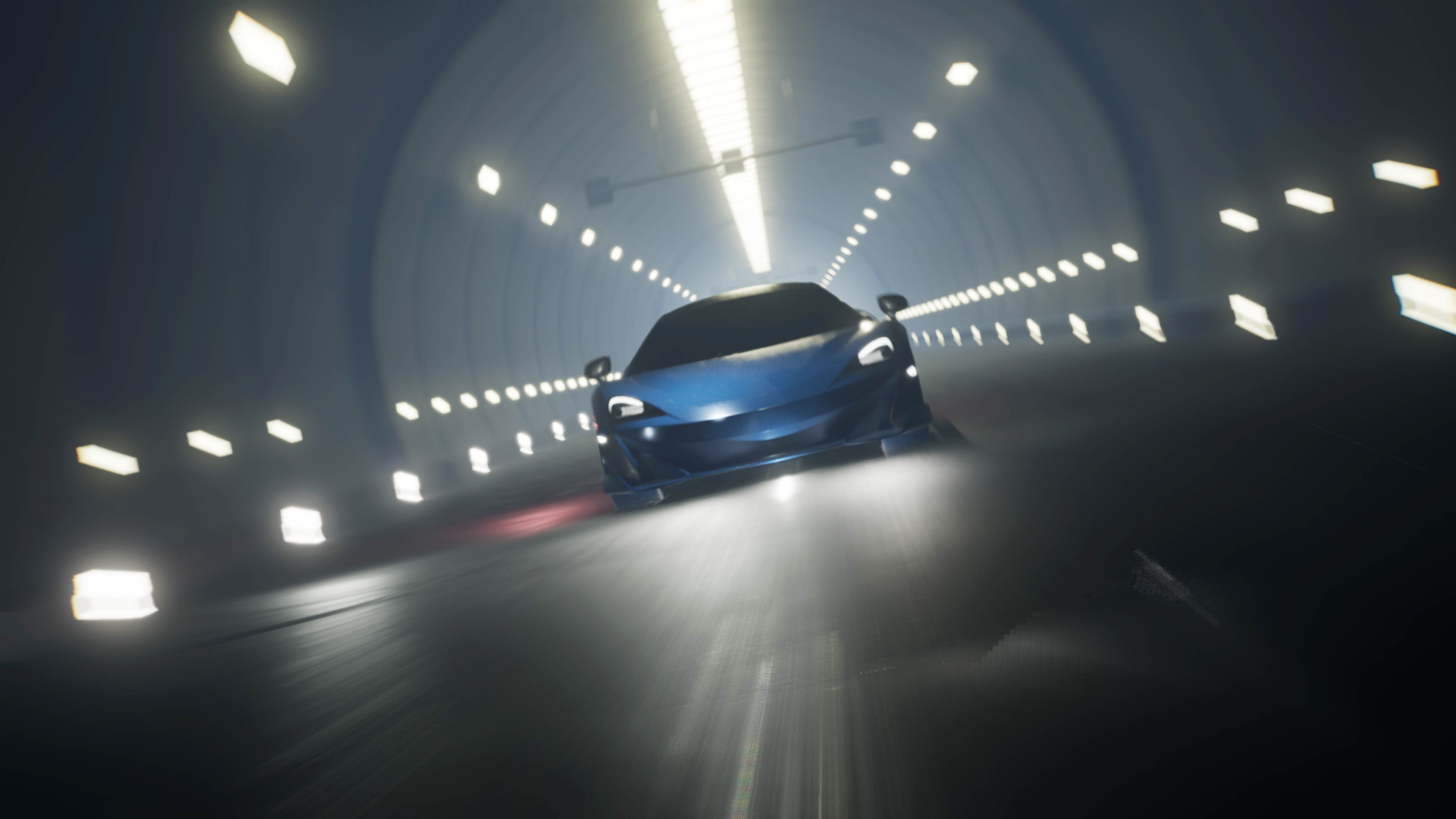
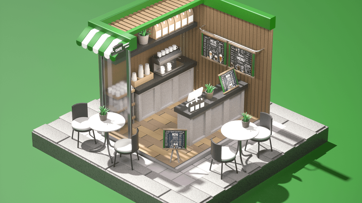
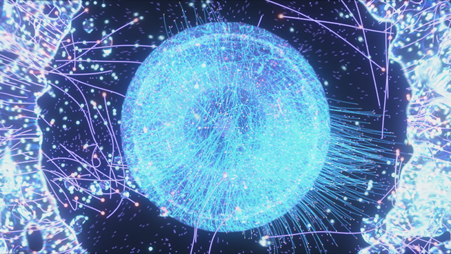
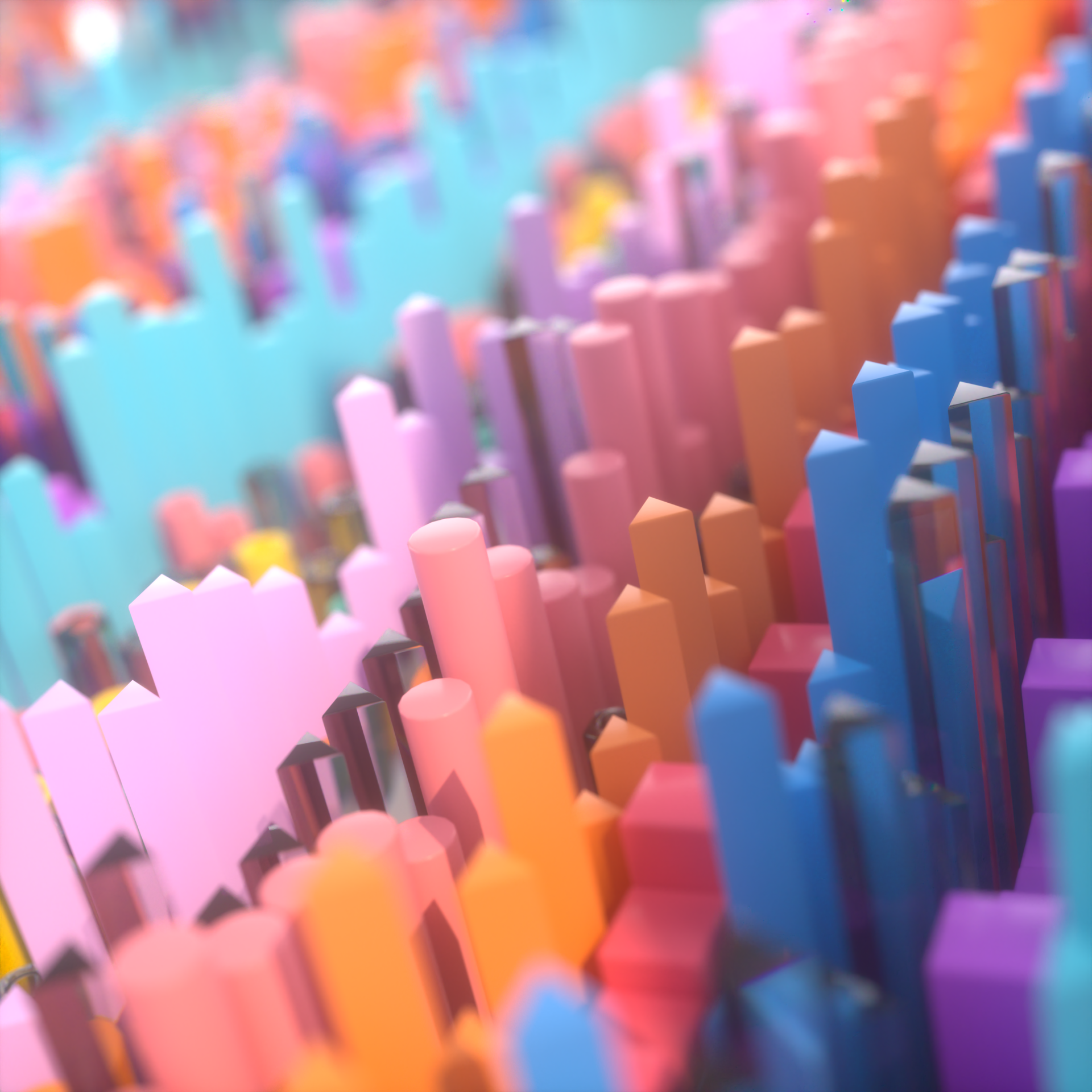
Individual illustration color artwork
기존의 시네마틱하고 리얼한 작업에 중점을 두었던 경향을 벗어나, 이번에는 캐주얼하고 귀여운 작업을 진행하고자 했습니다.
이를 위해 먼저 귀여운 레퍼런스를 수집하고 체계적으로 정리한 후, 적합한 색감을 선별하여 작업을 진행했습니다.
Beyond the existing tendency to focus on cinematic and realistic work, we wanted to proceed with
casual and cute work this time. To do this, we first collected cute references and organized them
systematically, and then selected appropriate colors to proceed with the work.
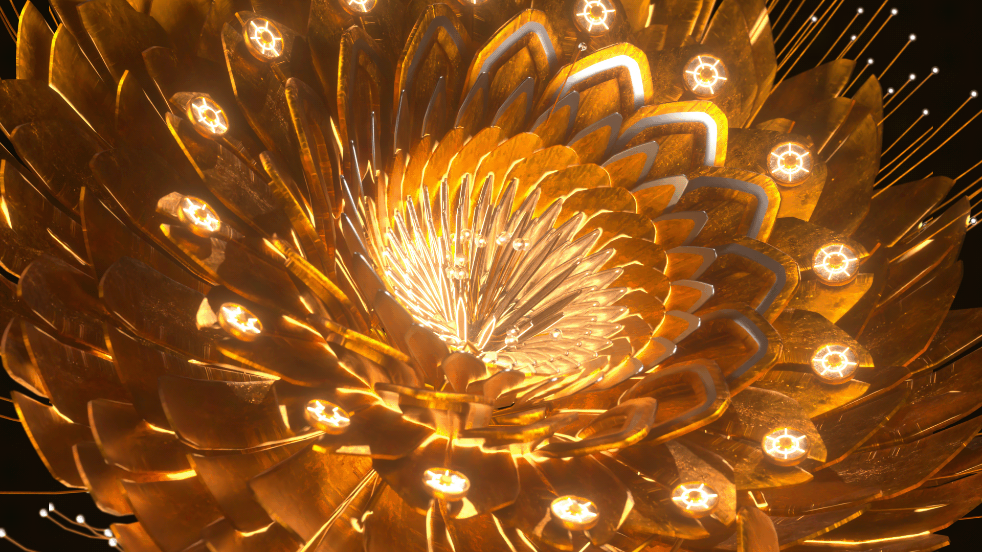
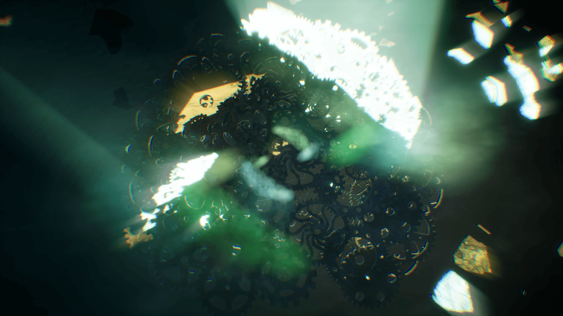
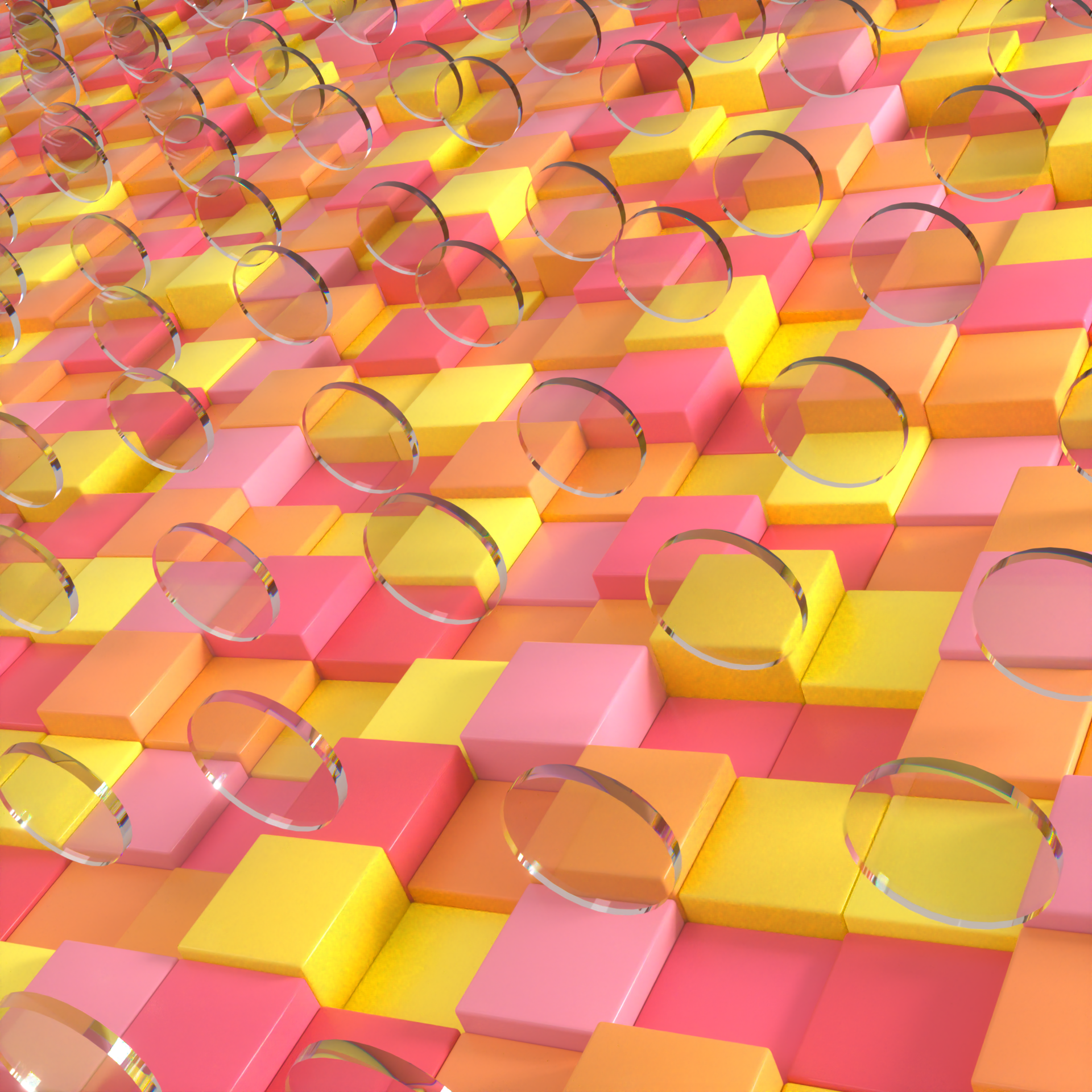
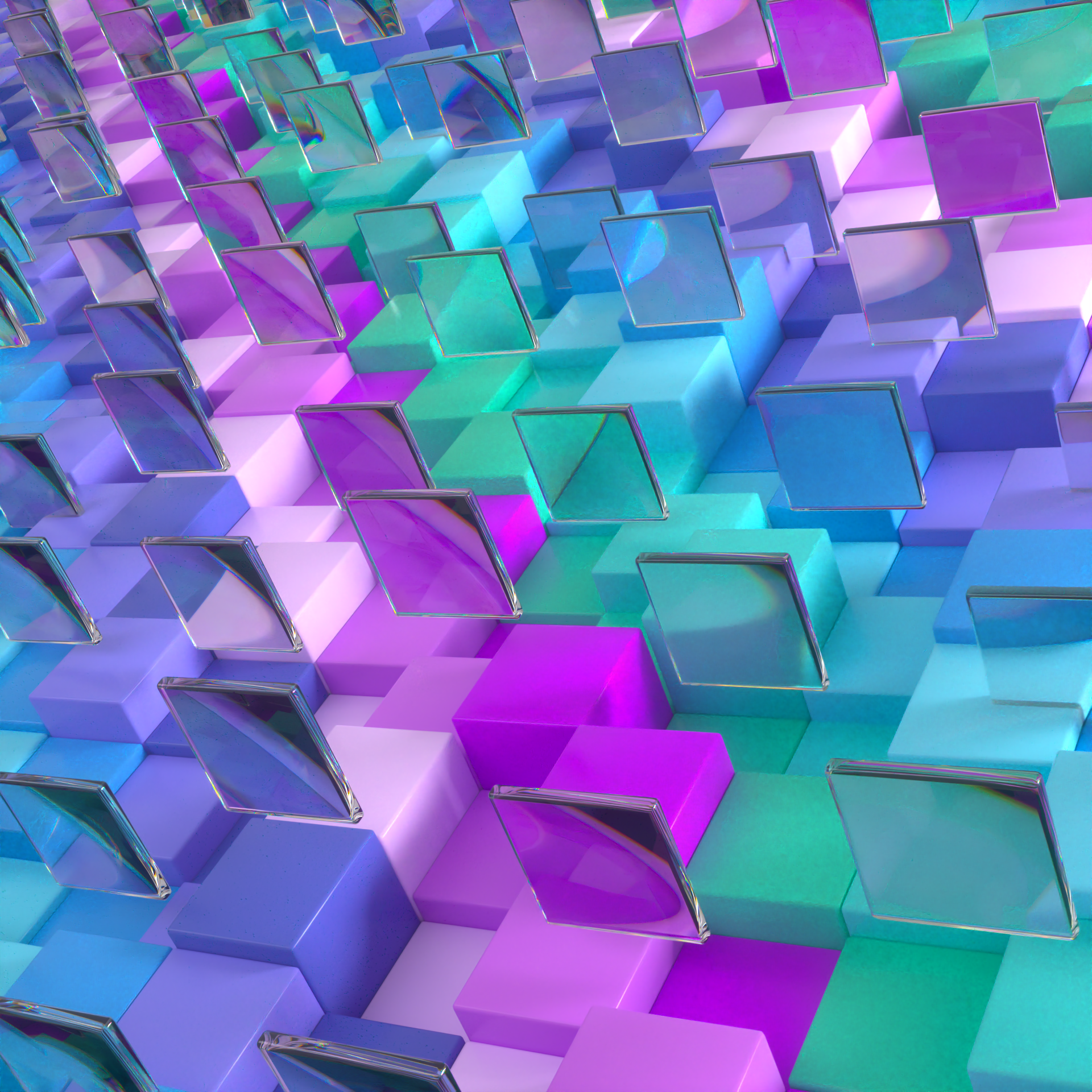
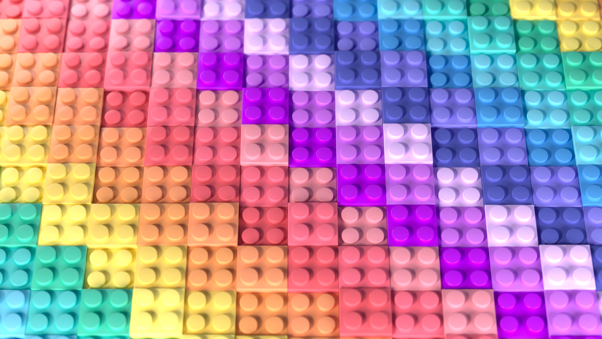
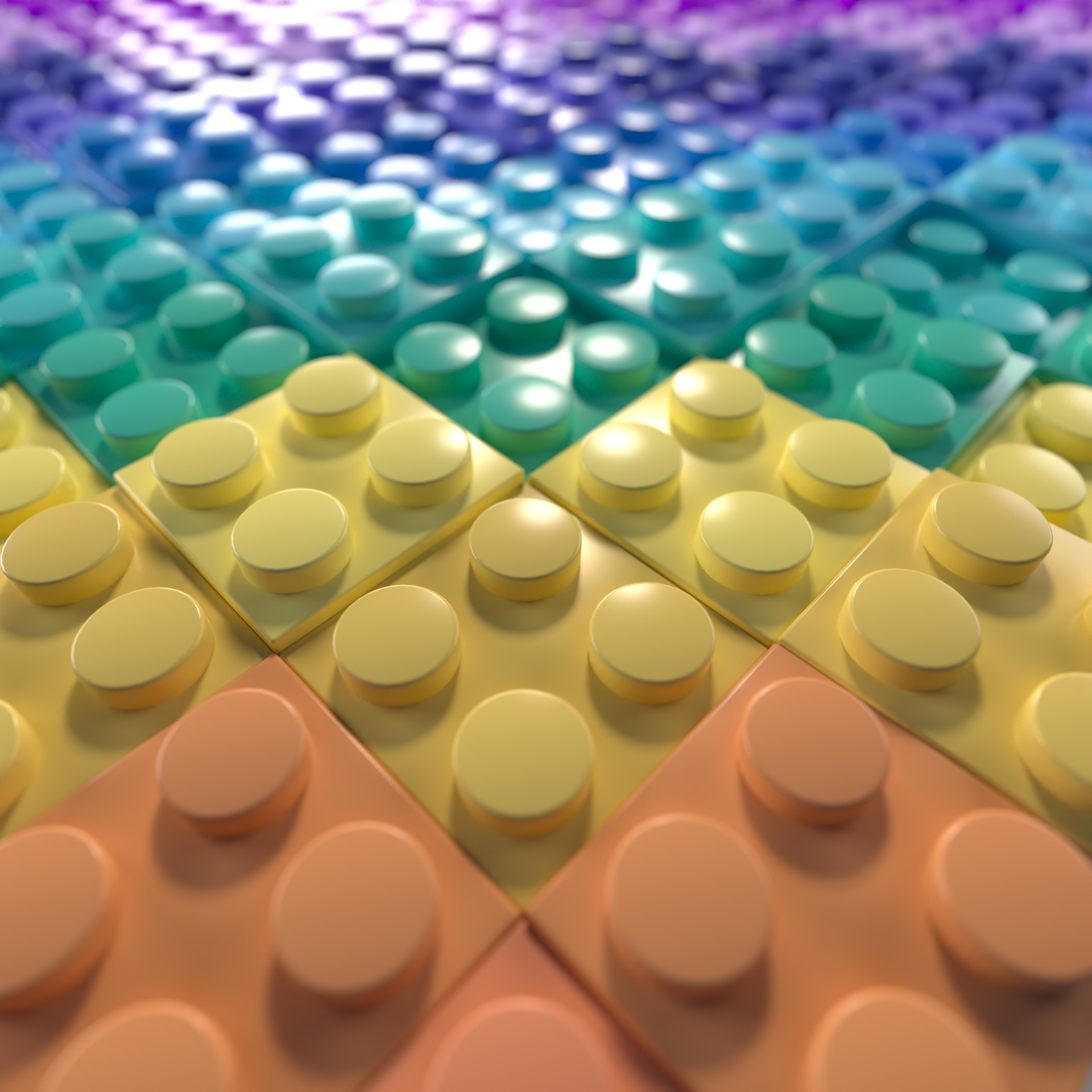
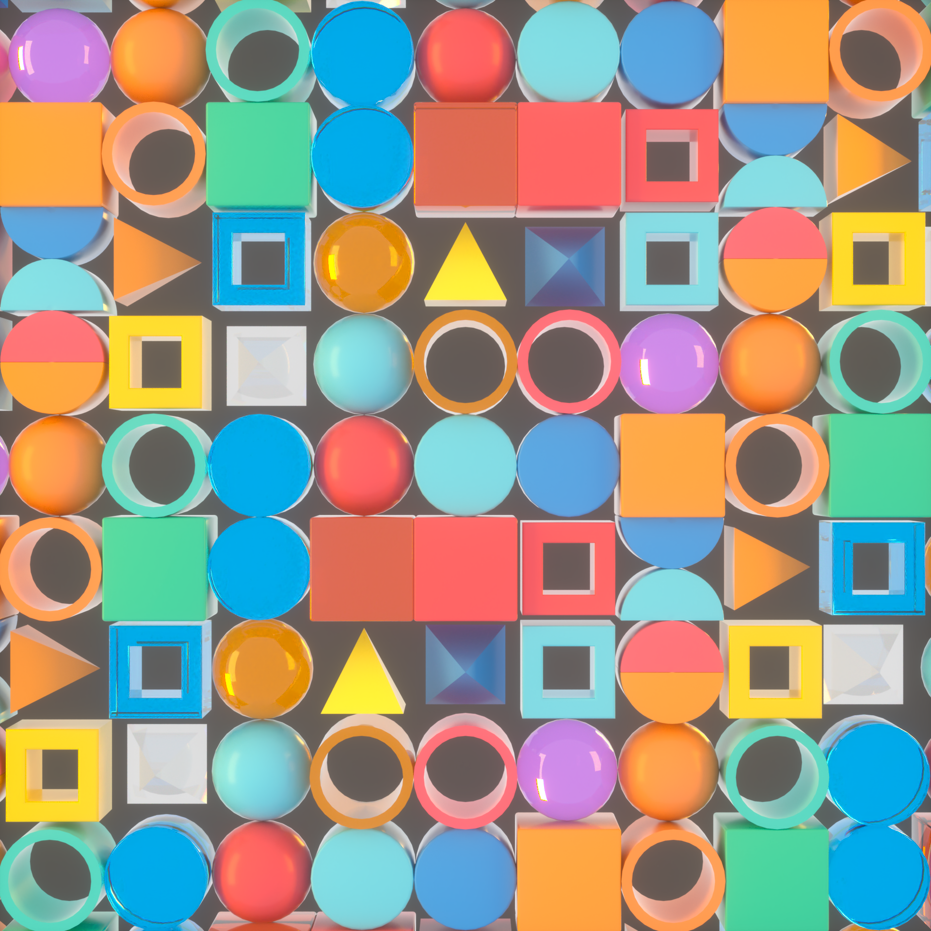
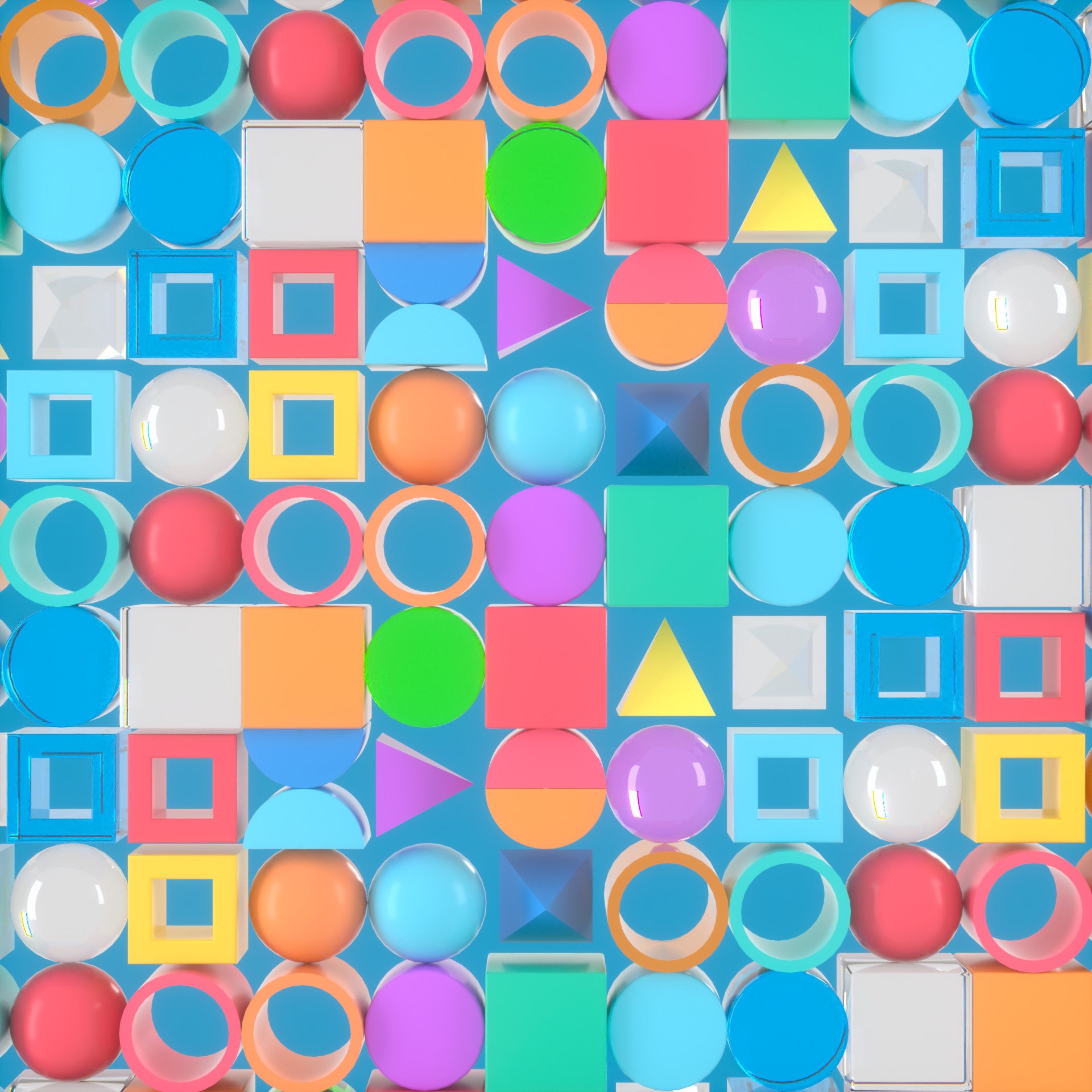
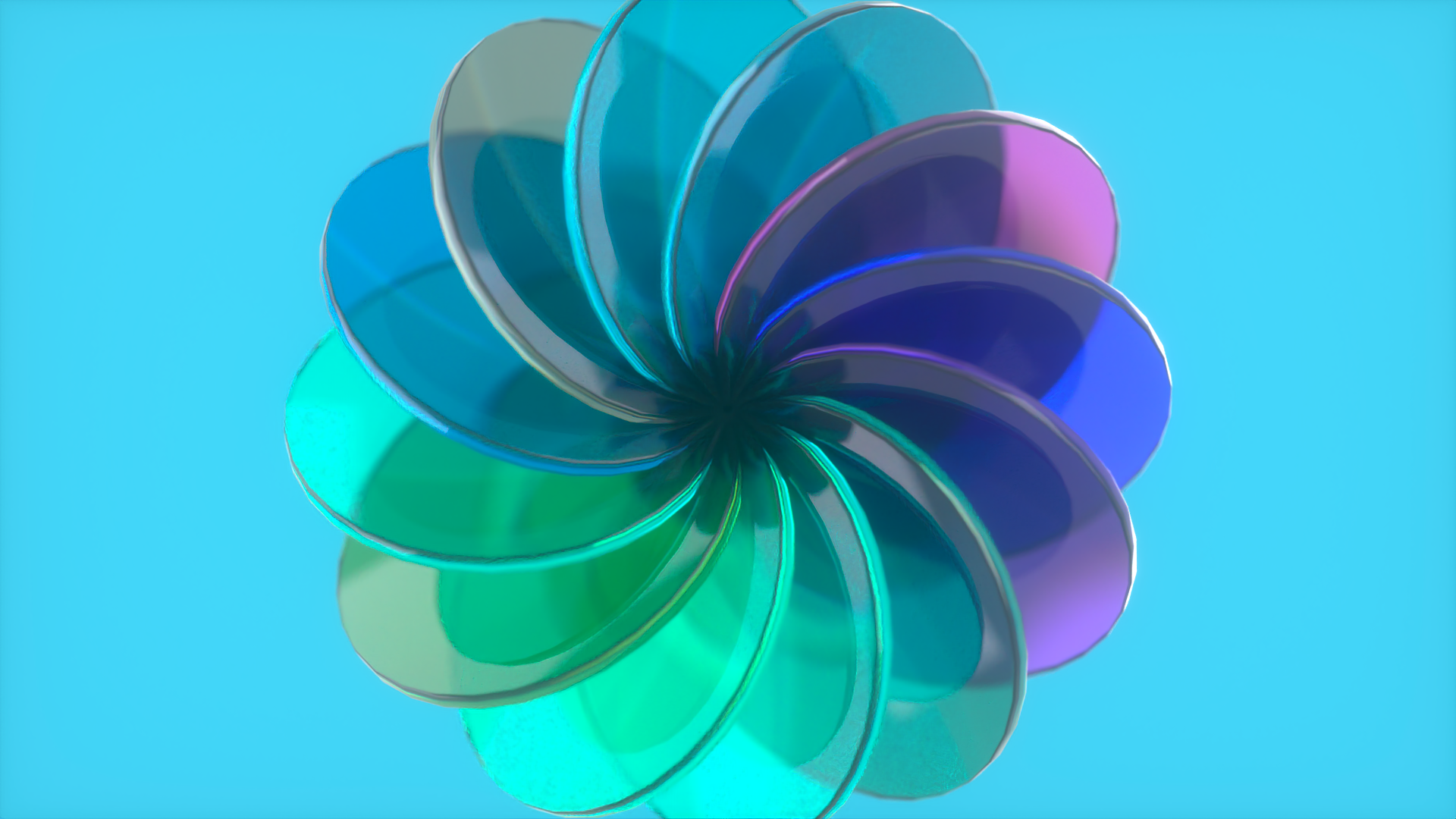
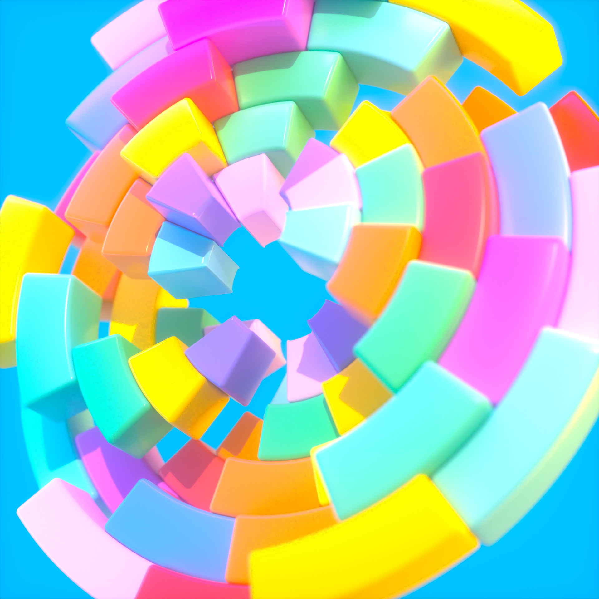
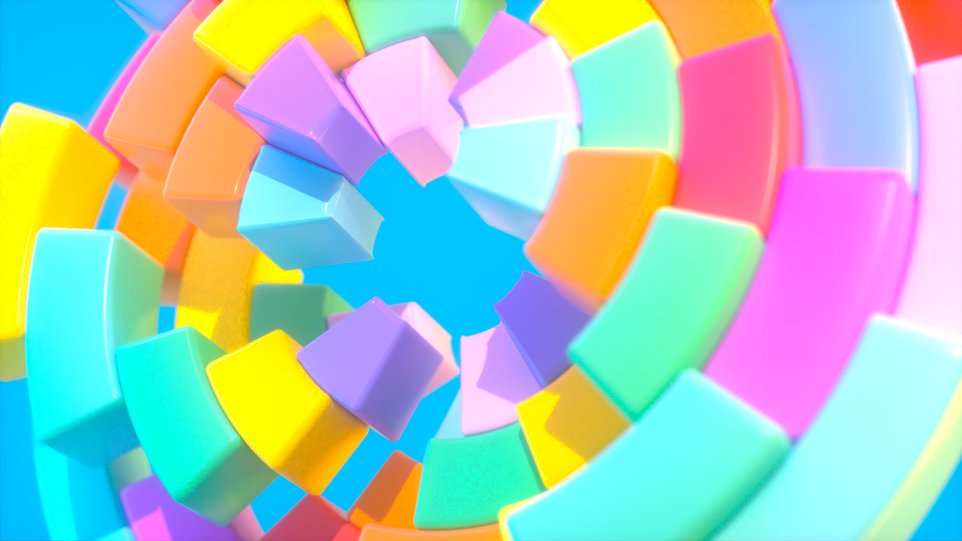
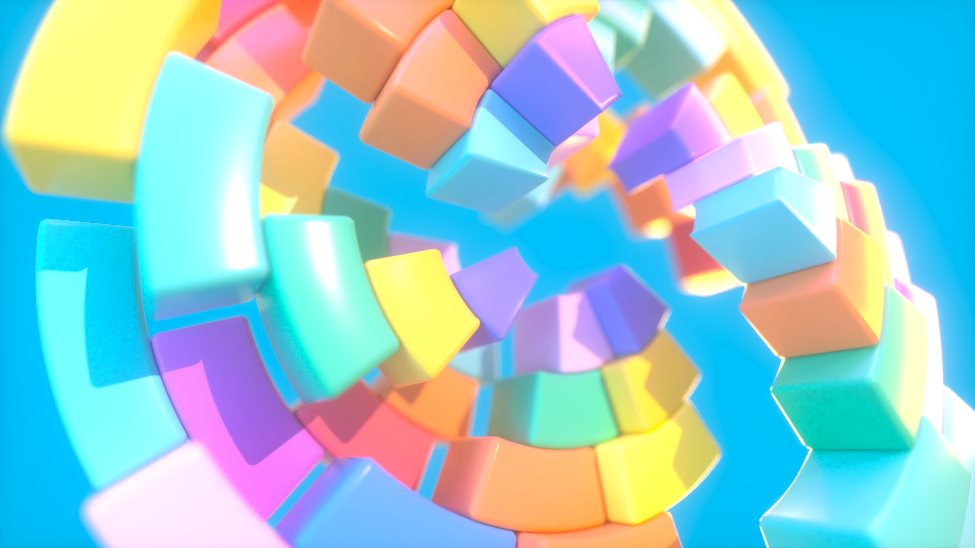
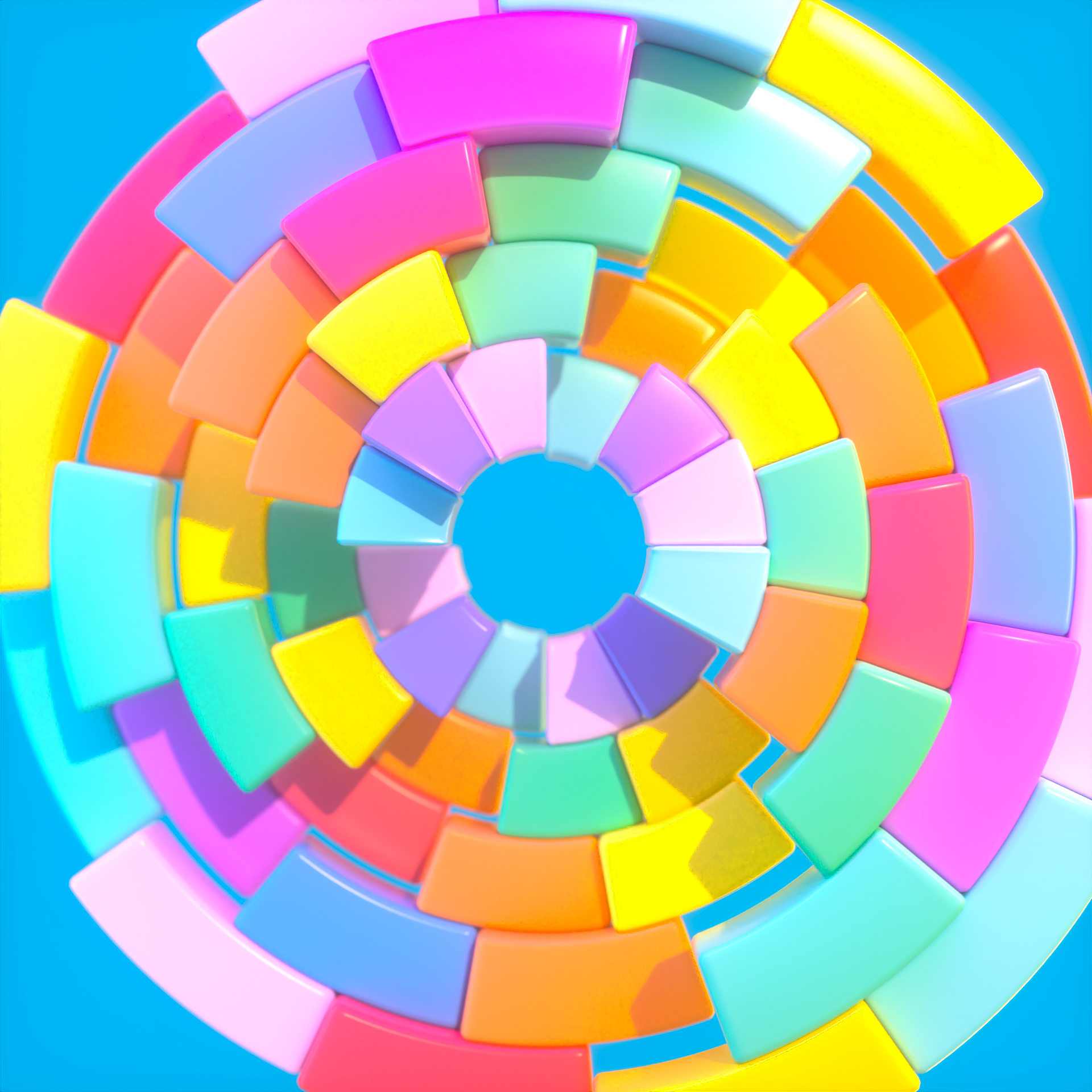
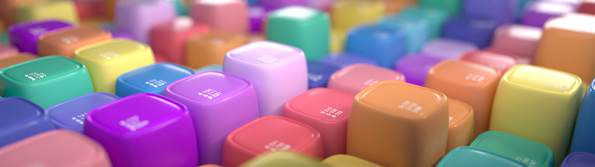
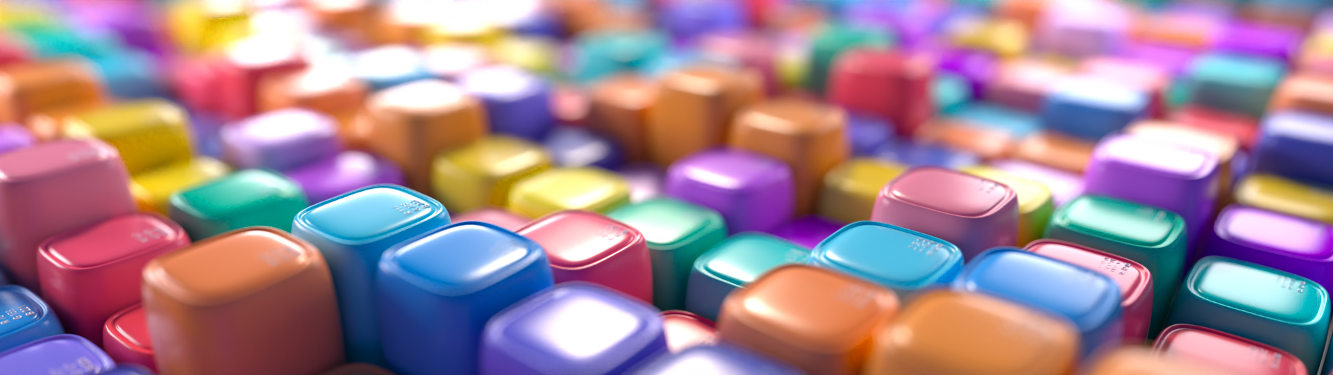
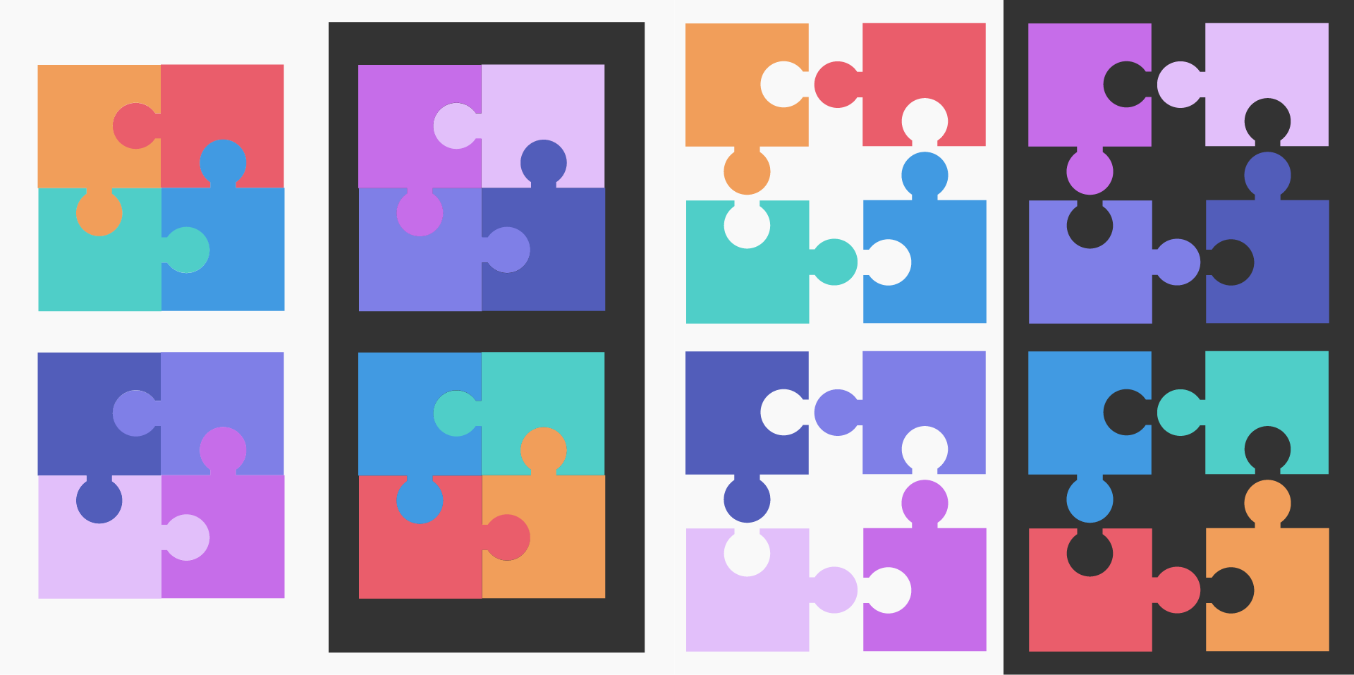
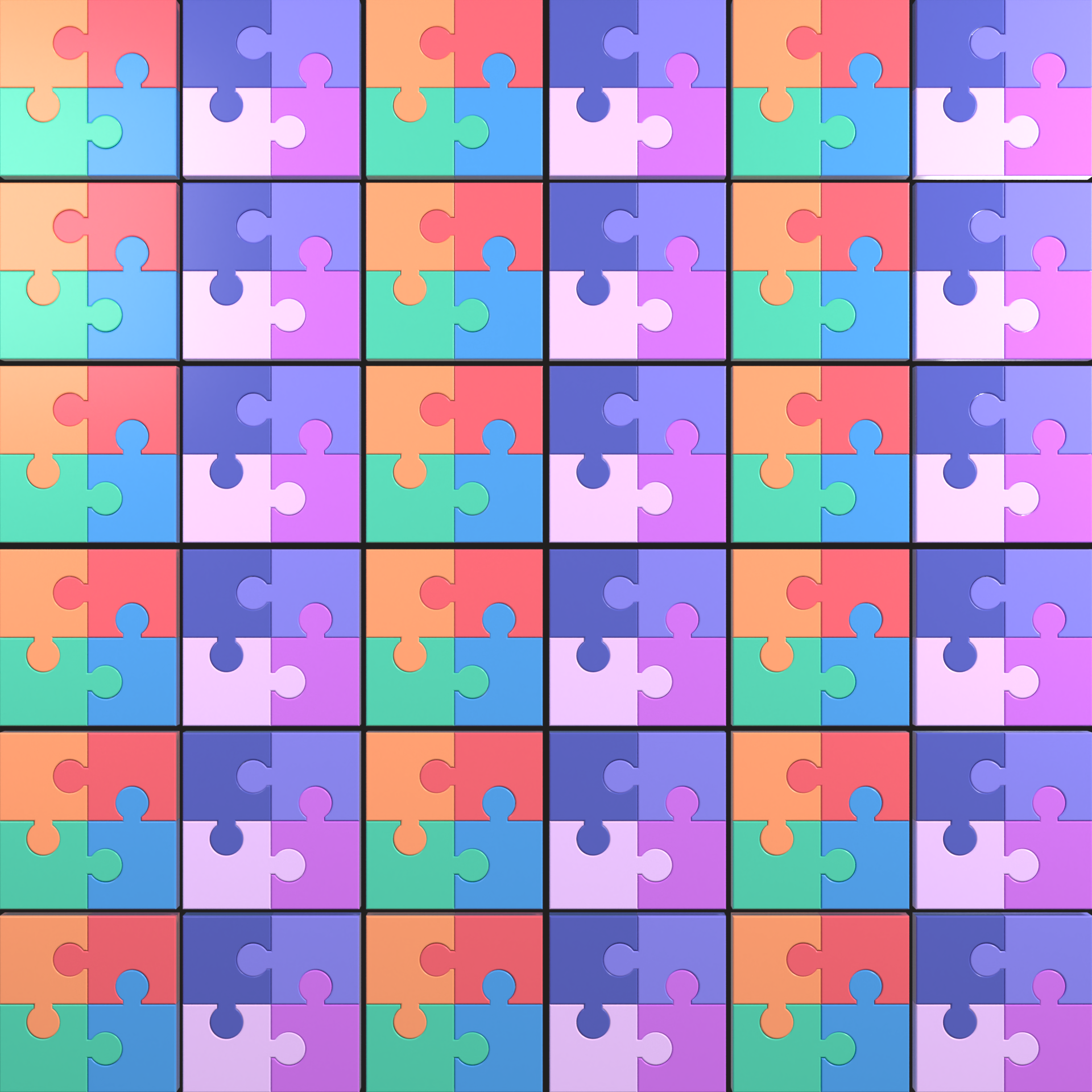
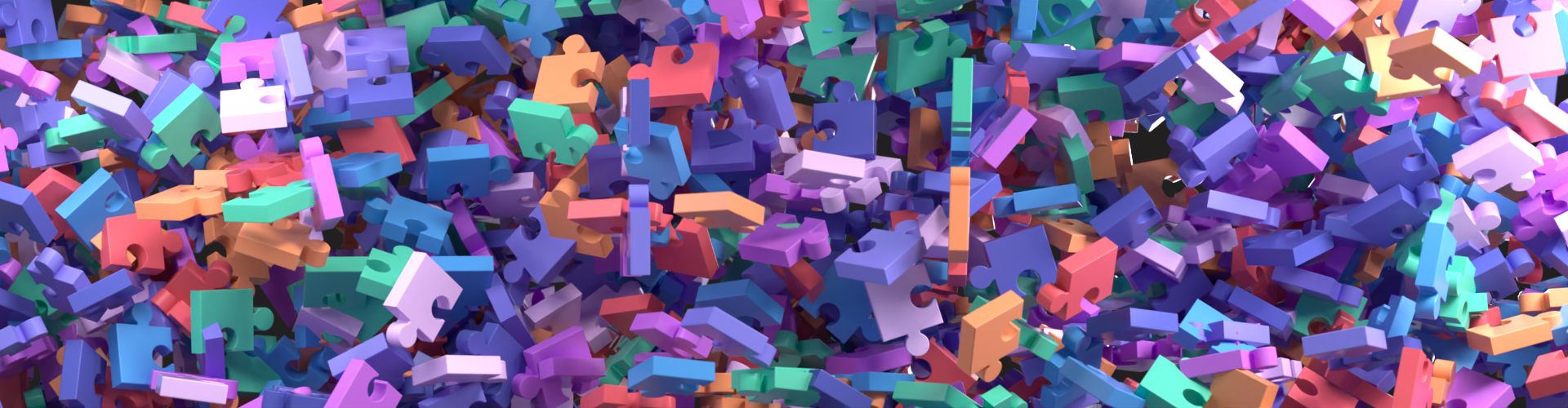
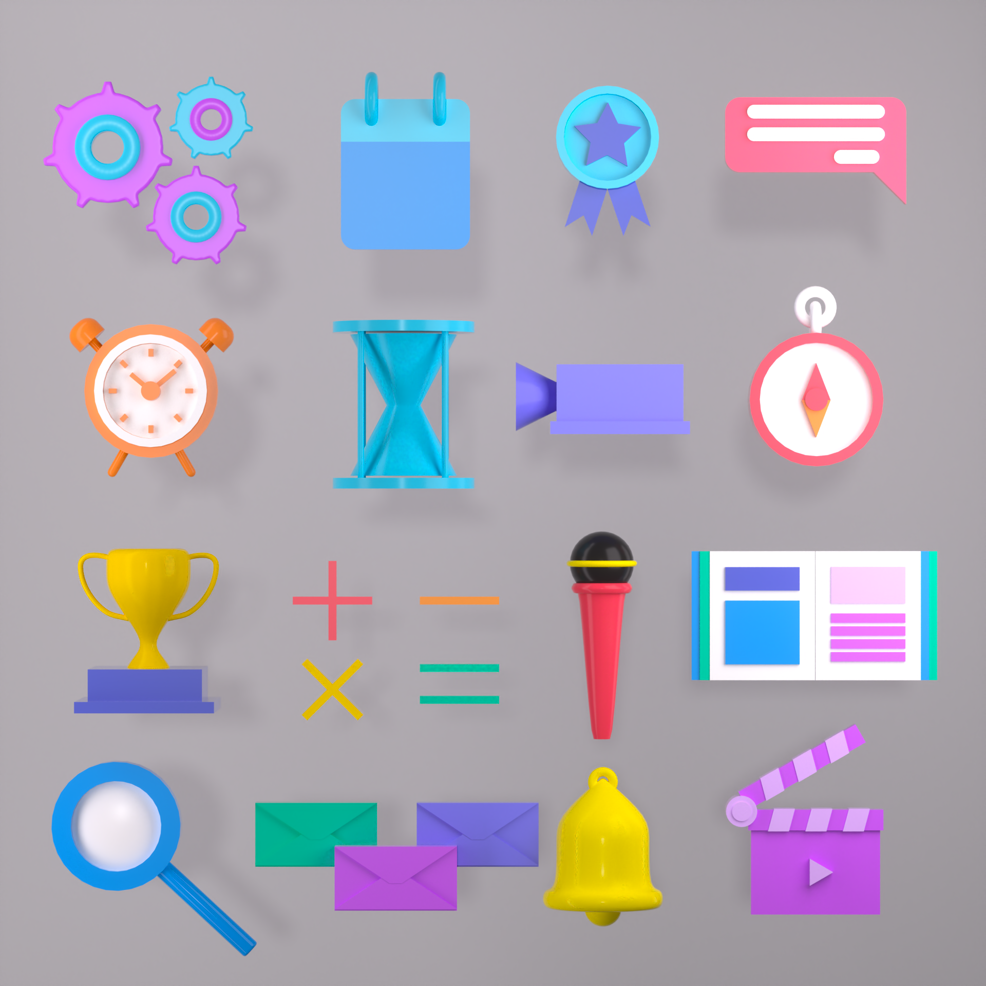
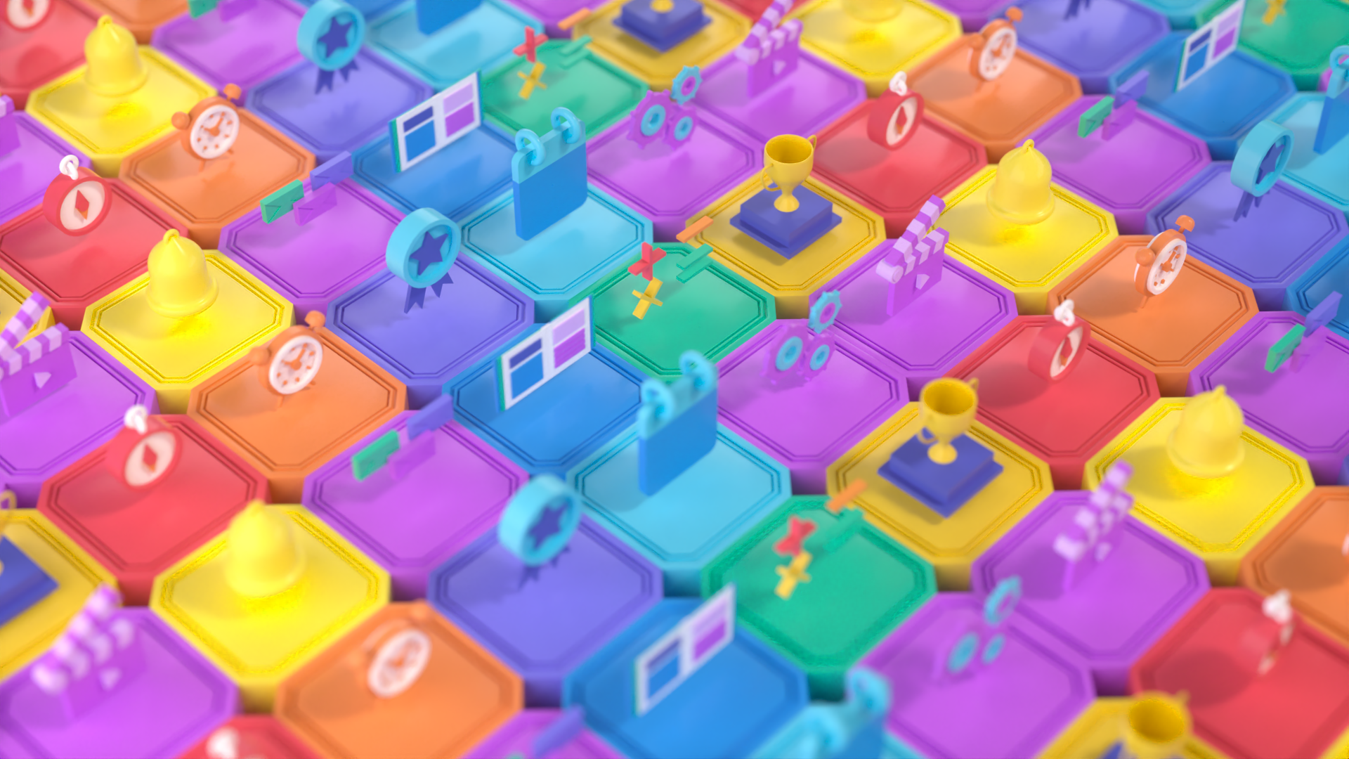
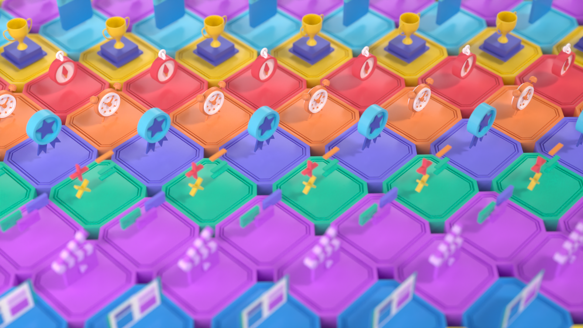
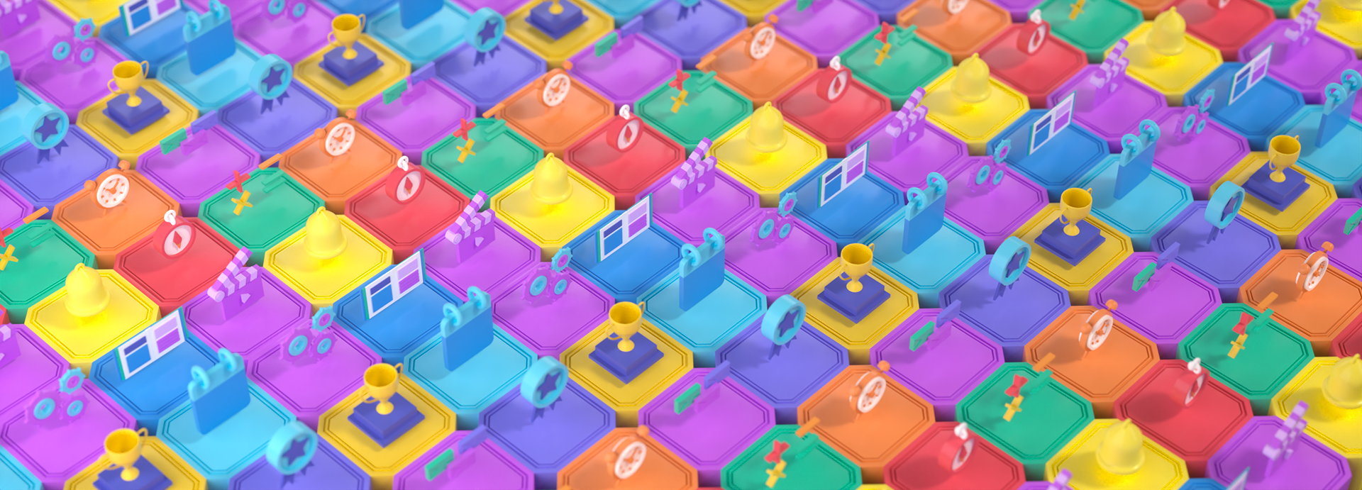
Pattern & Mograph
단순한 오브젝트를 패턴화함으로써 다양한 아웃풋을 탐색하고자 했습니다. 같은 오브젝트라도 패턴의 구성에 따라
단순하거나 복잡한 시각적 효과를 창출할 수 있으며, 이를 통해 디자인적으로 더욱 발전된 결과를 얻을 수 있었습니다.
We wanted to explore various outputs by patterning simple objects. Depending on the pattern
composition, even the same object could produce simple or complex visual effects, resulting in more
advanced design results.
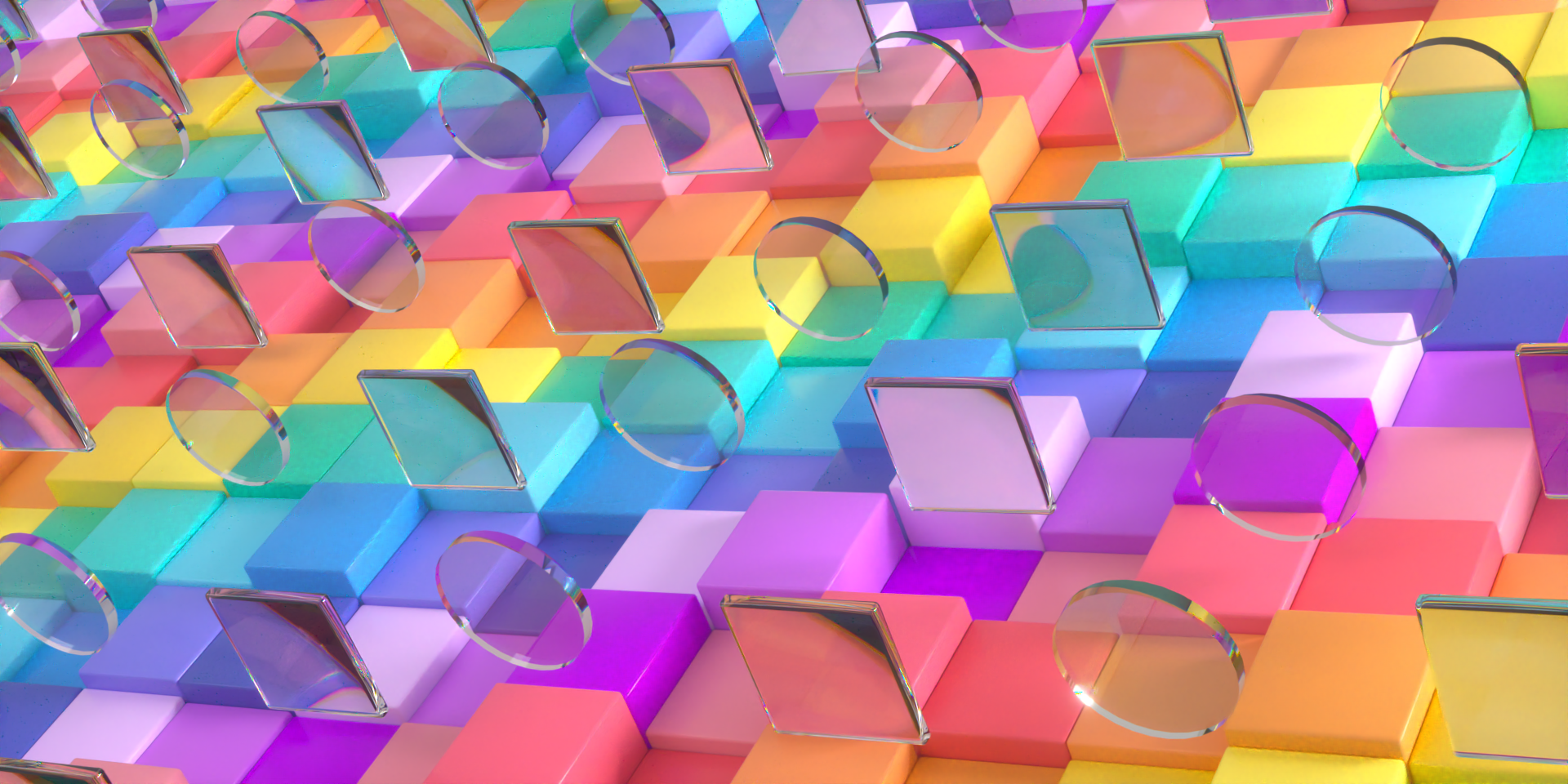
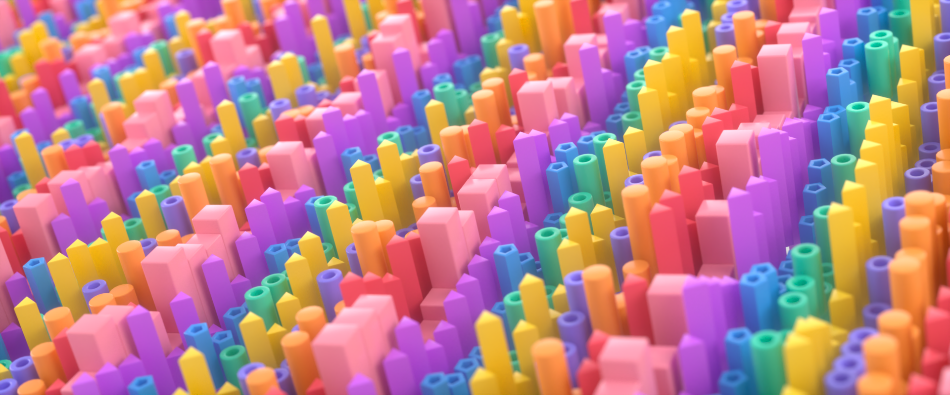
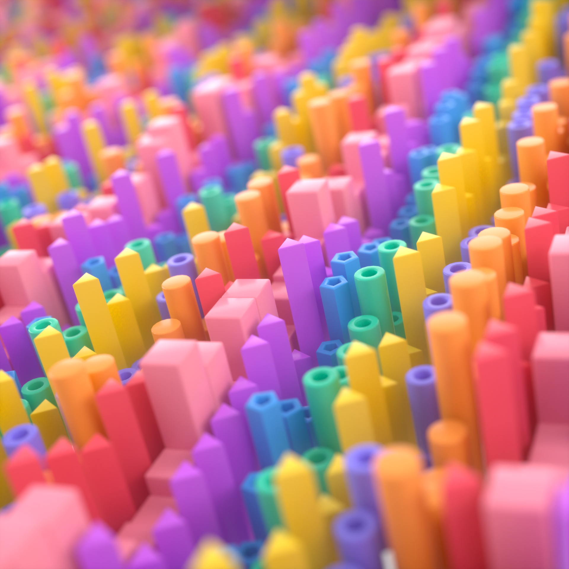

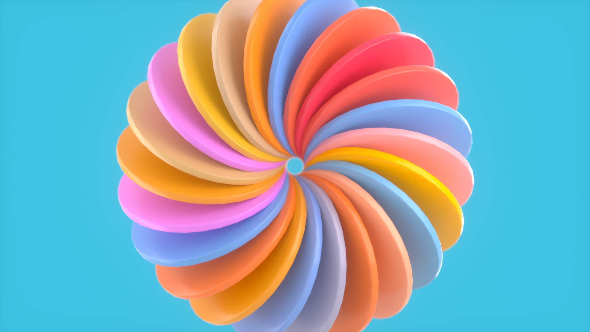
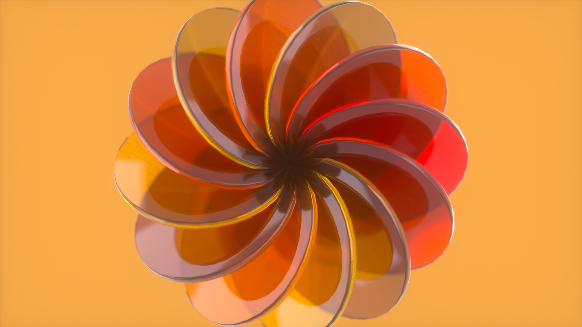
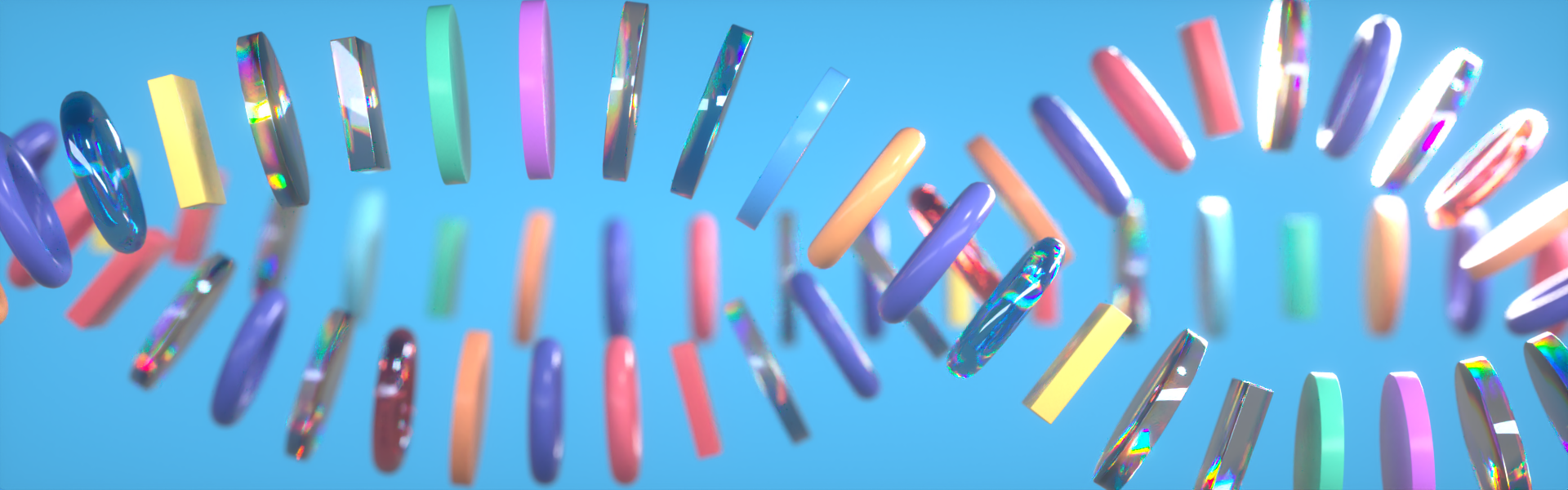
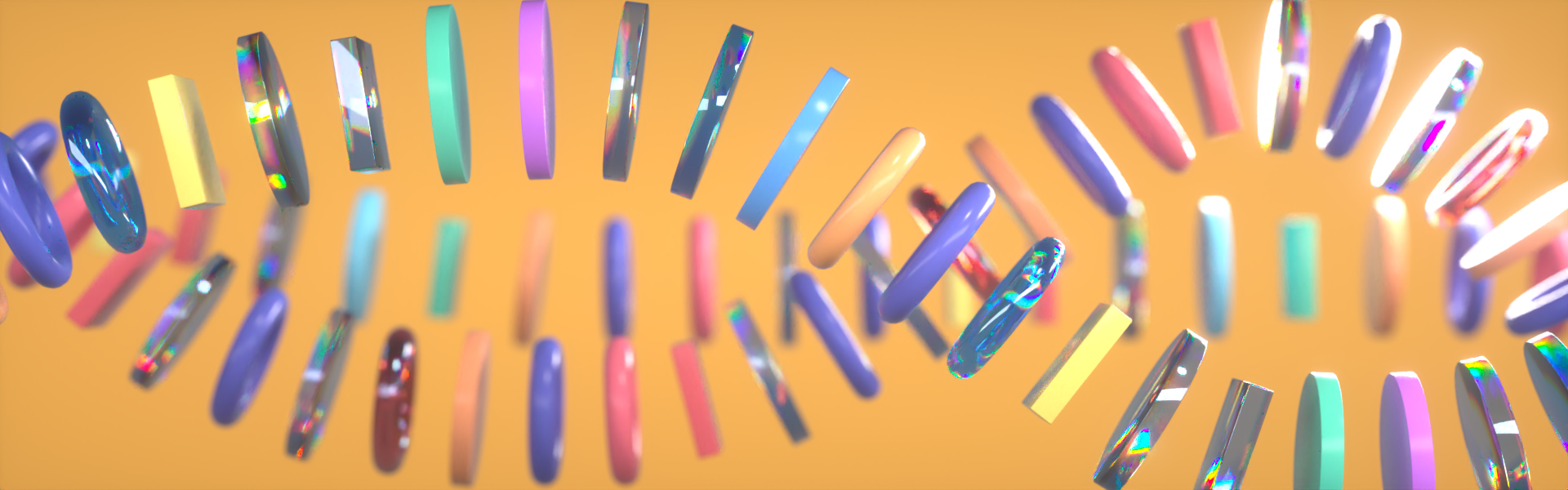
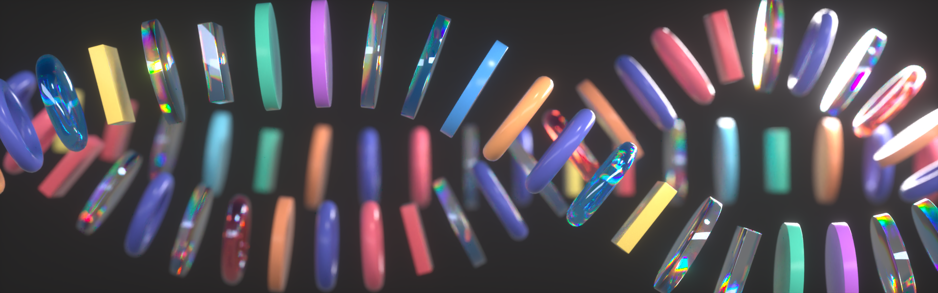
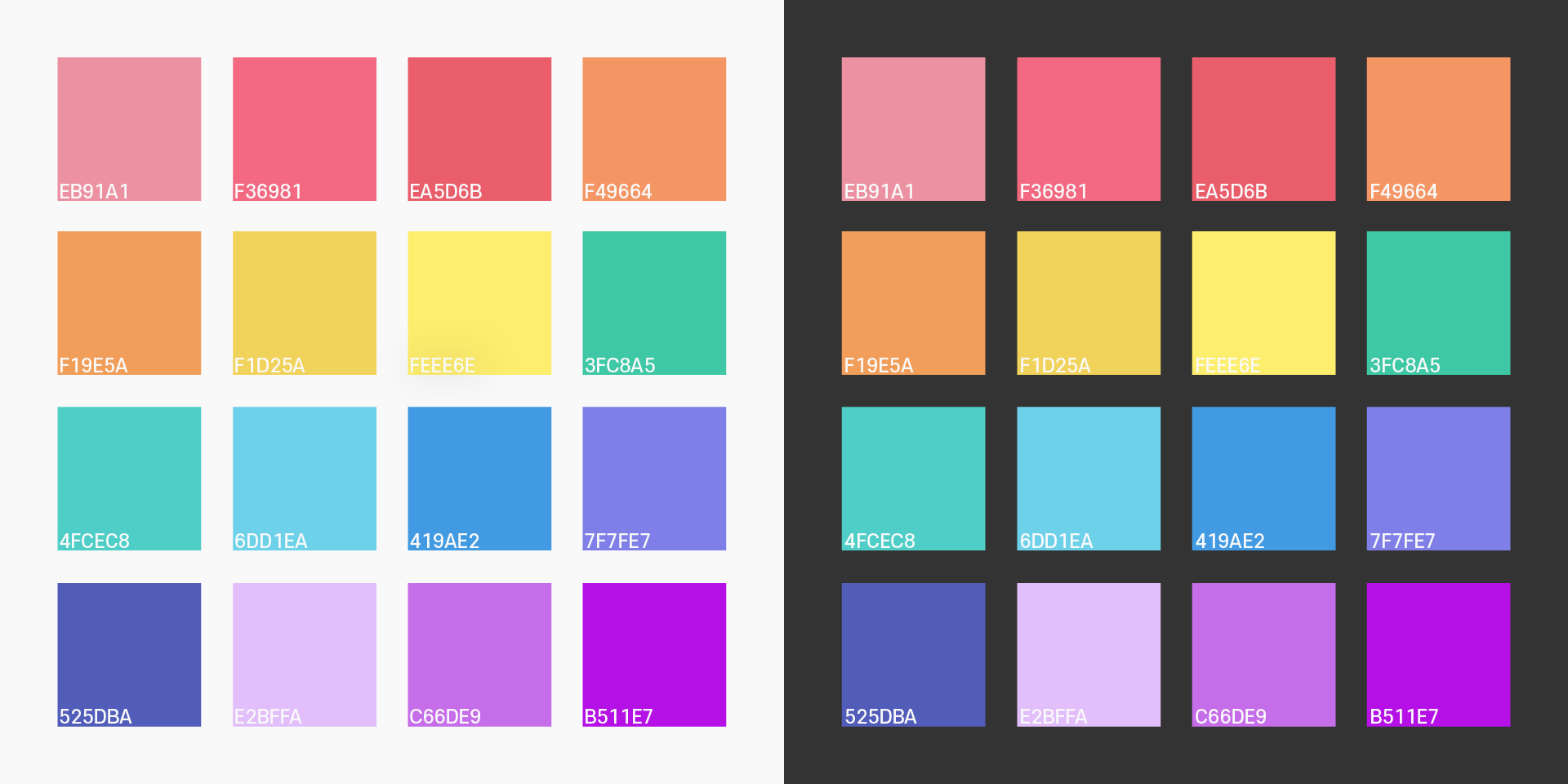
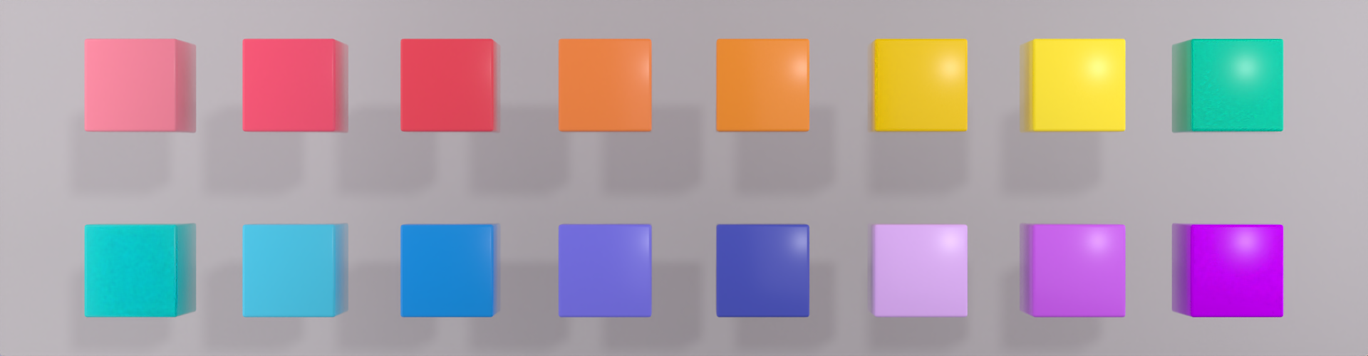
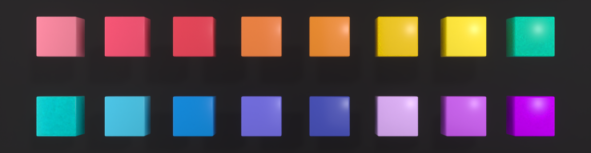
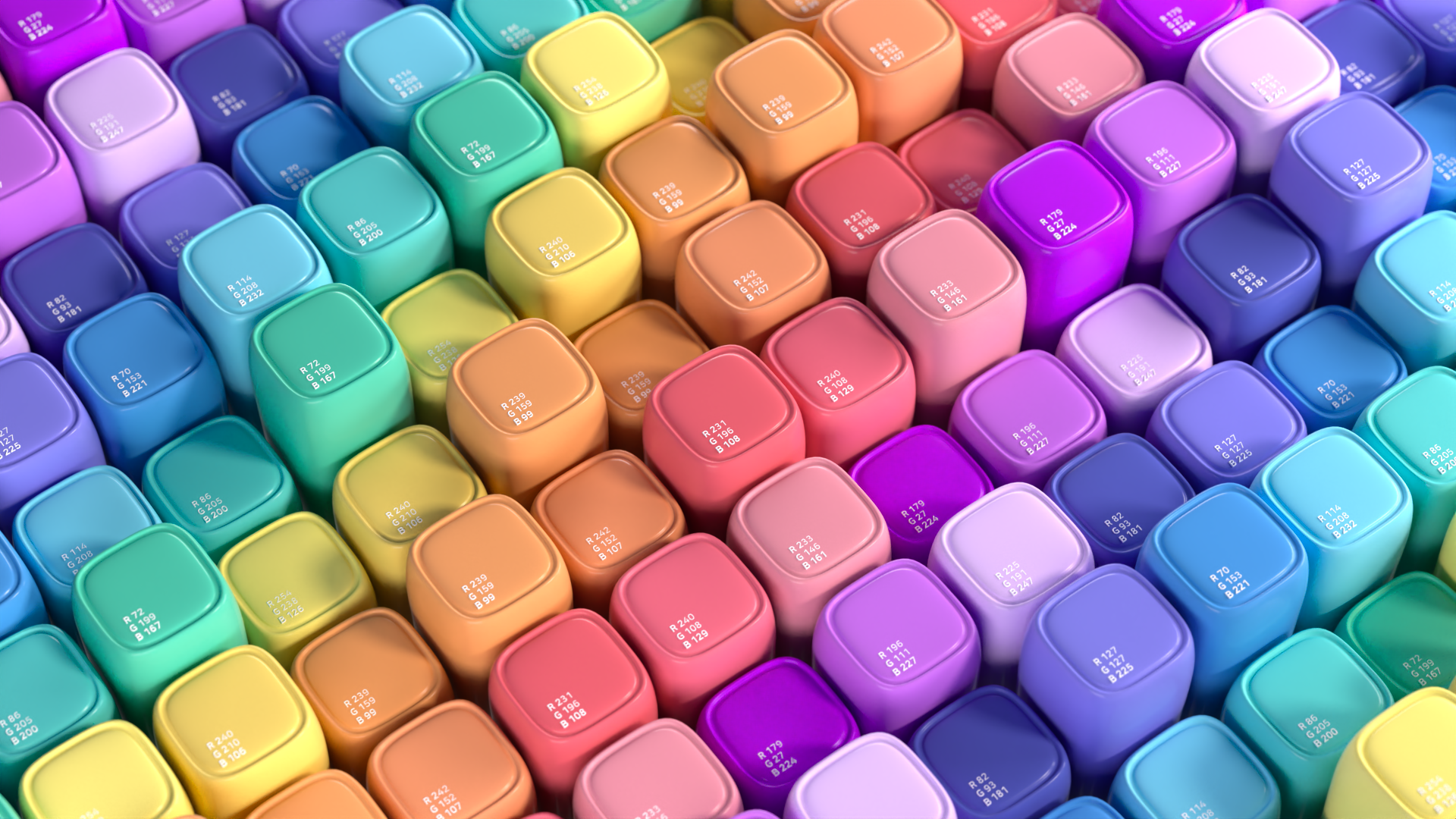
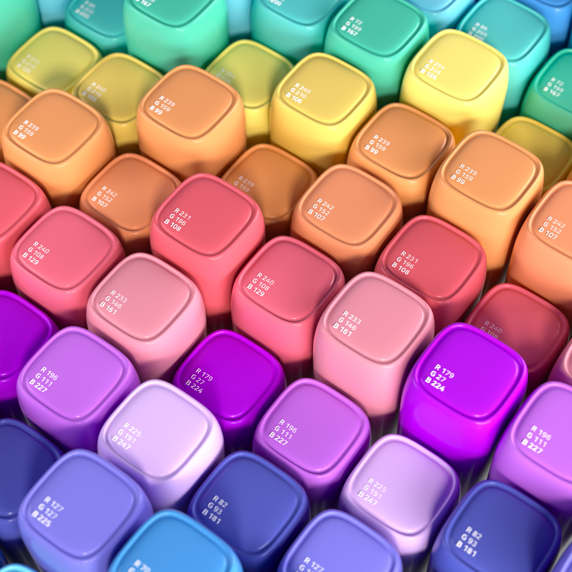
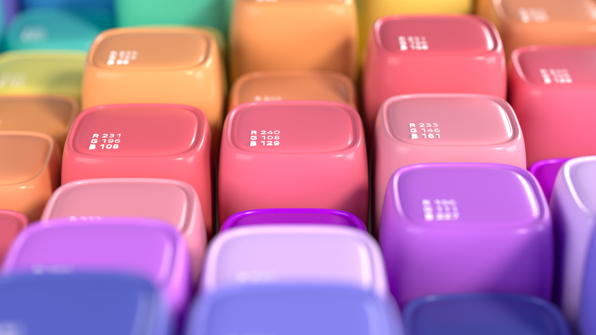
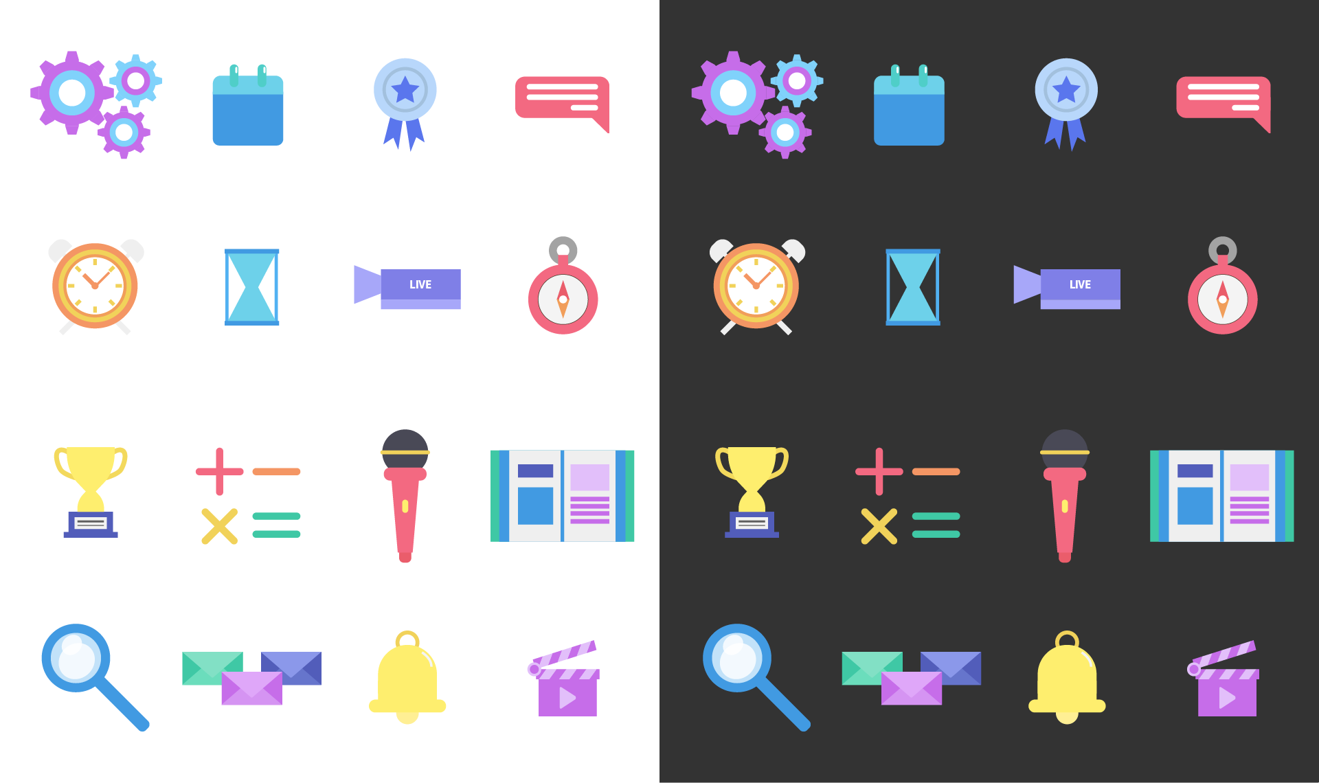
Color
레퍼런스에서 수집한 컬러 중, 캐주얼하고 귀여운 느낌을 주면서도 제 개인적인 성향과 잘 어울리는 색상들을
우선적으로 선별하였습니다. 강렬한 색상보다는 조화로운 톤의 컬러들을 중심으로 수집하여, 전체적인 디자인에
일관성과 통일감을 부여하였습니다.
Out of the colors I collected from the reference, I'd like to use colors that are casual and cute but go
well with my personal style It was selected. It was collected around harmonious tones rather than
intense colors, giving consistency and unity to the overall design.

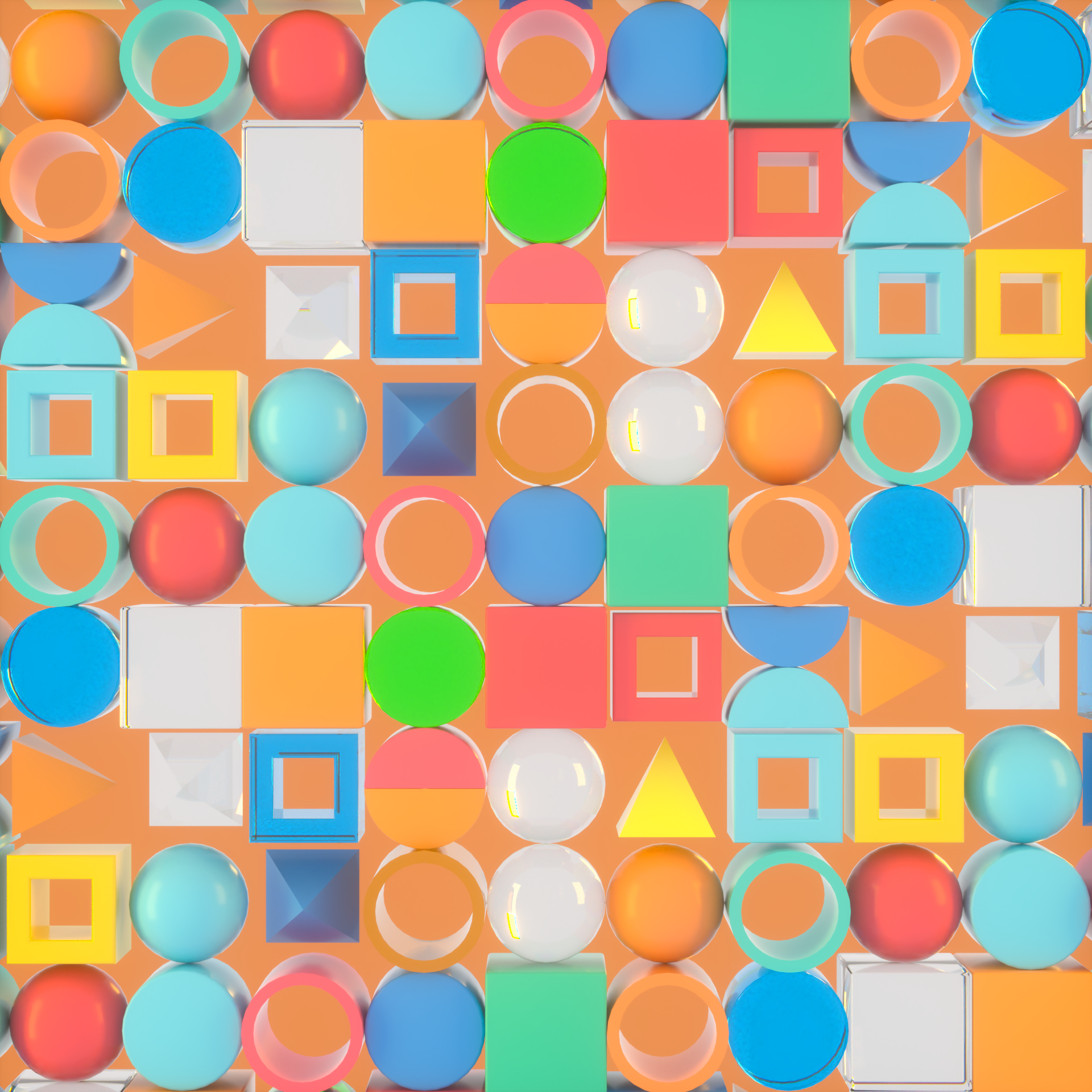
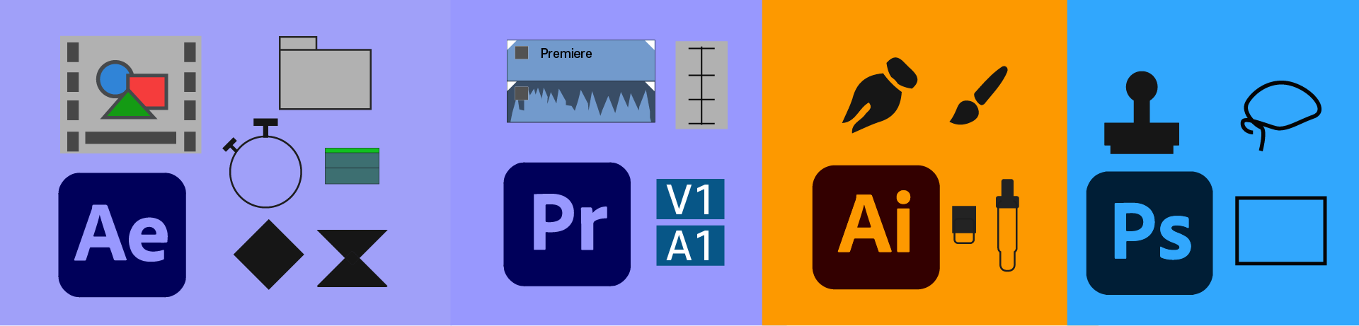
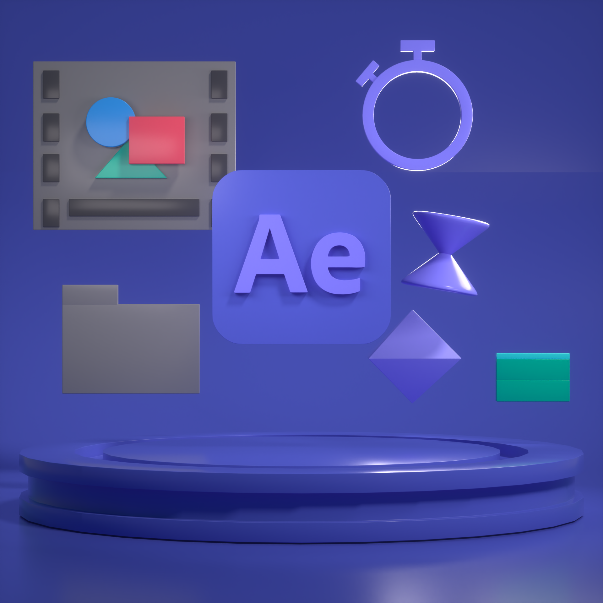
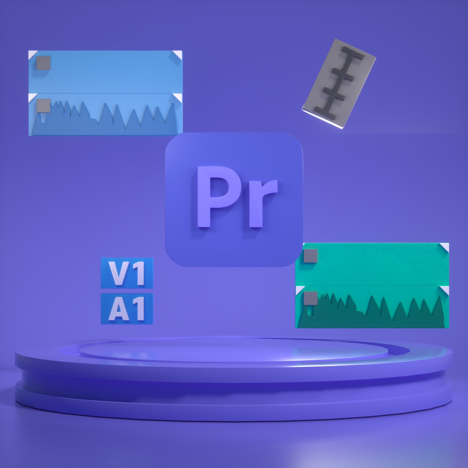
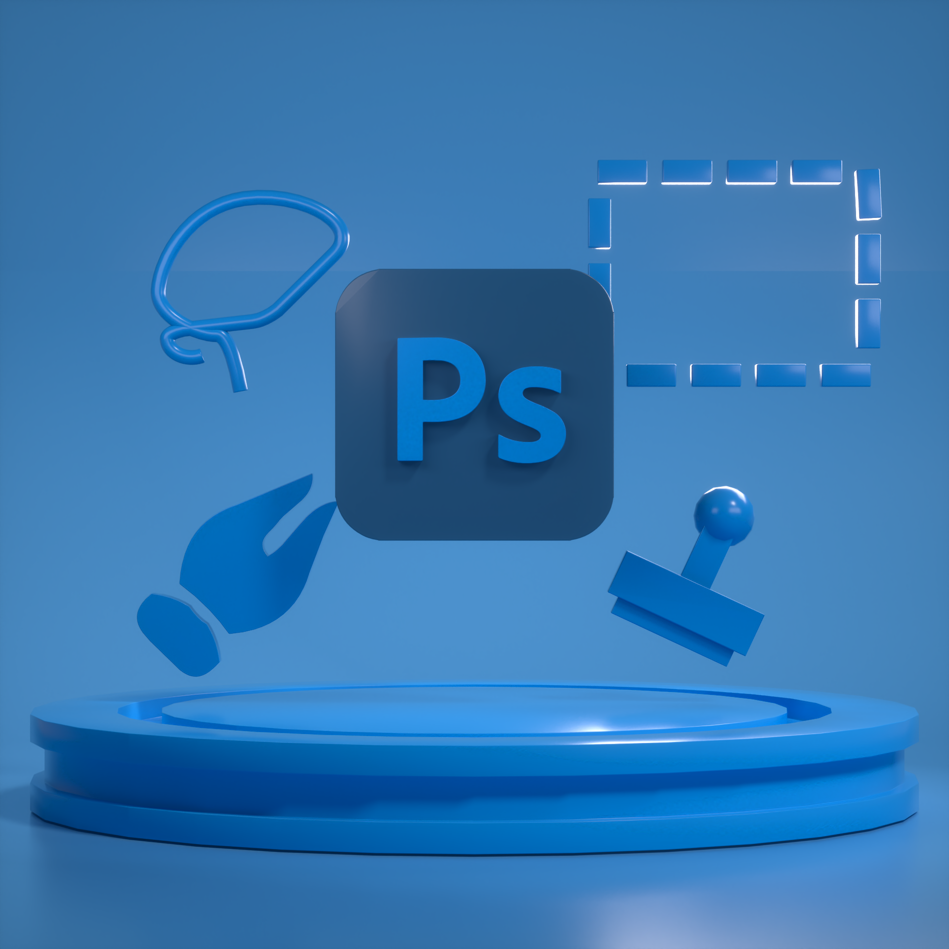
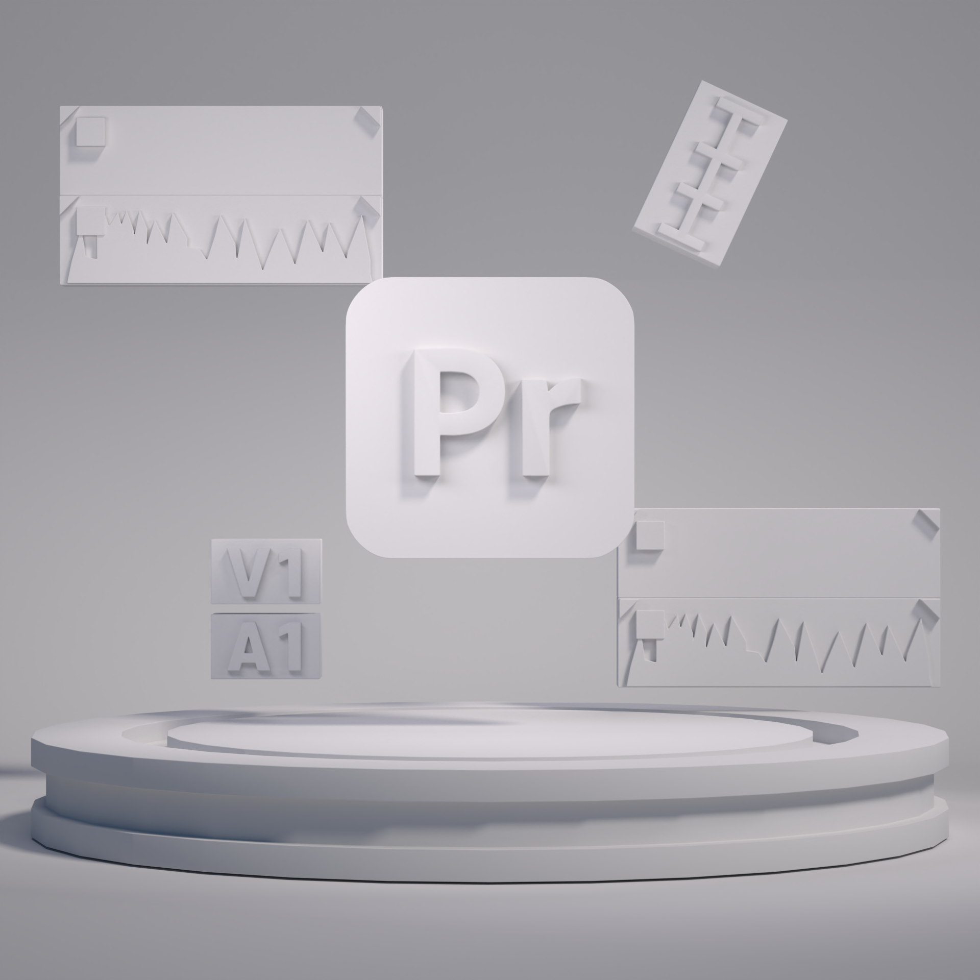
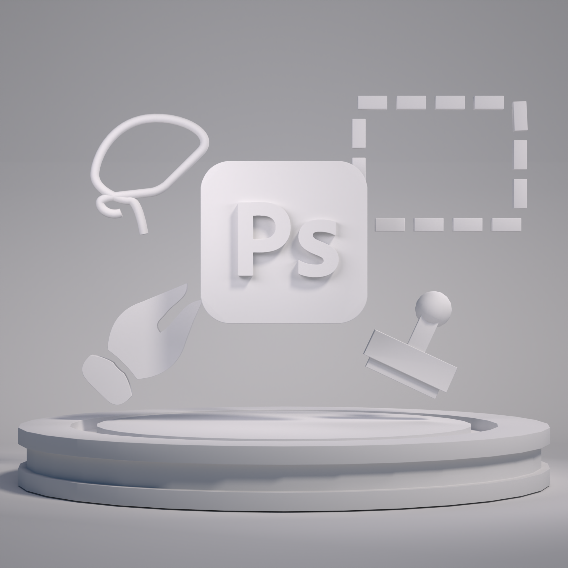
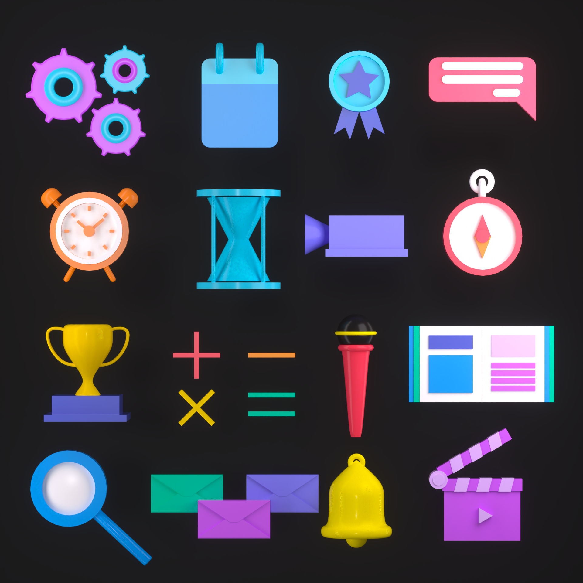
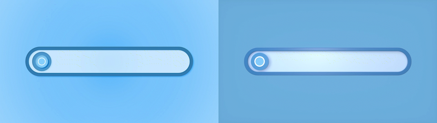
Icon
귀엽고 캐주얼한 오브젝트를 선별한 후, 기존 색감과의 조화를 테스트하여 최종 작업을 진행했습니다. 이후,
각 오브젝트에 맞는 모션 작업을 추가하여 디자인에 재미와 동적인 요소를 더했습니다.
After selecting cute and casual objects, the final work was done by testing the harmony with existing colors. Afterwards, motion tasks were added for each object to add fun and dynamic elements to the design.


Ref